


Table of Contents: 2015 MAY–JUNE No. 404
Huston M, Jentsch J. Responsive Web Design for MedlinePlus: Access from Your Phone, Tablet or Desktop. NLM Tech Bull. 2015 May-Jun;(404):e2.
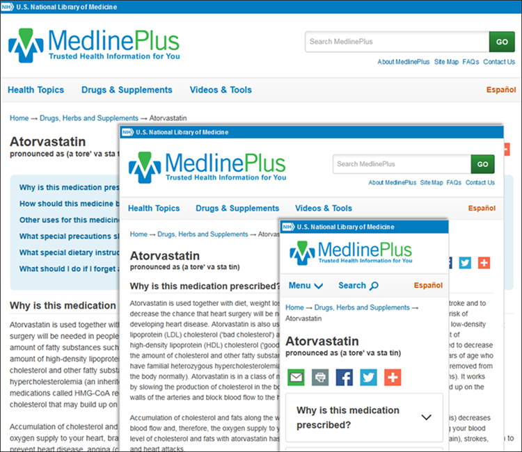
The National Library of Medicine (NLM) released responsive versions of MedlinePlus and MedlinePlus en español in April 2015 (see Figure 1). Users now have one destination for MedlinePlus when using any device. We invite you to try out the full responsive design on your smartphone, tablet or desktop by visiting MedlinePlus in English at //medlineplus.gov/ and in Spanish at //medlineplus.gov/spanish/.
Responsive Web Design optimizes your interaction with a site by adjusting each page for the device you are using, whether that is a desktop monitor or mobile touchscreen. Responsive pages automatically change their layout to fit your screen.

The key features of the redesigned sites are:

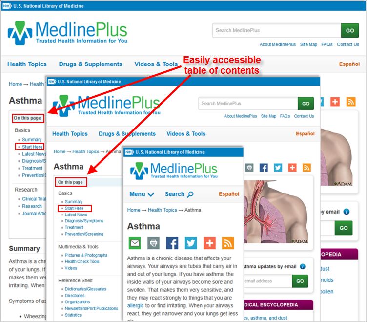
Health Topic pages boast an improved architecture, with the table of contents (On this page) now appearing above the topic summary for easy access. Additionally, the Overviews section has been merged into the Start Here section, now found just below the topic summary.
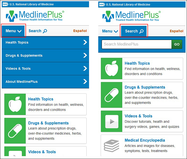
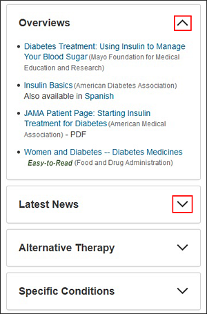
Mobile and tablet users will also enjoy:
This new version is the final step in a phased plan to redesign MedlinePlus and MedlinePlus en español to behave responsively. Because this latest release enables all users, regardless of device, to access MedlinePlus.gov, there is no longer a need for the separate mobile locations at http://m.medlineplus.gov and http://m.medlineplus.gov/spanish/. These sites are now retired; visitors to them are redirected to the new version of MedlinePlus.gov.
An earlier phase in the plan was accomplished just six months ago in October 2014, when a responsive version of MedlinePlus for mobile devices was released to our mobile site locations at //m.medlineplus.gov and //m.medlineplus.gov/spanish/ (see MedlinePlus Mobile Update: Full Access from Your Phone). This design replaced our original mobile sites, launched in 2010.
By
Melanie Huston
Public Services Division
and
Jennifer Jentsch
Public Services Division